Monday, 18 July 2011

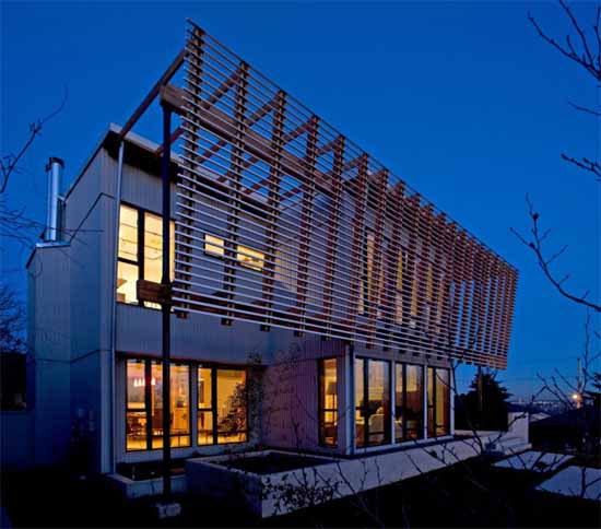
Screen House by Randy Bens

Randy Bens architects recently finish a renovation project to add a new floor to an existing 1954 bungalow, which is situated in a post war suburban neighbourhood in the city of New Westminster, BC. The existing house was an L-shaped bungalow which was too small for clients. The new floor would be the domain of the parents, and the boys would acquire main floor bedrooms of a more suitable size. The addition would be composed of a studio, master suite, and a deck to take advantage of the view.

The main floor interior was left largely in tact and the simple palette of hardwood floors, wood trims, and off-white walls was continued throughout the new second floor and serves as a neutral backdrop for the client’s art collection. The result is a warm interior punctuated by colour, and an intense play of light generated by the screen.

A new steel stair unites the two floors, and the solid wood treads match the recycled fir flooring which is used throughout the second floor. New millwork is constructed from a mixture of Appleply and Plyboo bamboo plywood. The millwork in the ensuite has Paperstone (recycled paper) on the counter and tub tops, while the walls are clad in blue back-painted glass. A composite recycled tile is used on the floor and shower walls to complete the palette.


The overall massing was influenced by the desire to stack new program on existing walls and by the creation of a new exterior space on the second floor with access to views and sunlight. To counter the vertical nature of the resulting mass and shade the south facing living room, a horizontal screen was introduced which gives the composition a more restful and balanced appearance. To further reinforce the horizontality of the screen, a concrete planter wall was introduced at the ground plane. The vertical cedar siding, gently sloping roofs, exposed glulam beams and rafters are all present, but contemporary in their composition. Bright rolled zinc panels were placed above and besides existing window openings, and then aligned with new openings above. A simple through-wall flashing detail serves as a datum for window heads, mullions and sills, and is present on all facades.

Architecture: Randy Bens
Photographs: Roger Brooks Photography

Monday, 29 November 2010

Sustainable Maintencillo House by Jonas Retamal

Jonas Retamal Architect recently designed a sustainable house in the coast of Chile’s Valparaíso Region. This house created with wooden material with 2 space. Interior was designed with contemporary style, with warm and cozy ascend.

Saturday, 16 October 2010

Monthey Kindergarden Building by Bonnard Woeffray Architectes

In collaboration with Nuno Ferreira, Bonnard Woeffray Architectes have designed Monthey Kindergarden building in the town’s Cinquantoux Park and replaces the former villa that had become obsolete. Conceived as a large house for children, the venue assumes an almost organic shape that merges with the wooded park and offers a range of interior spaces. Following the same logic is its composition of volumes topped by a roof composed of gently slanting sections. The building can accommodate 180 or so children. It offers two floors arranged as six separate units.

Monthey Kindergarden by Bonnard Woeffray ArchitectesMonthey Kindergarden by Bonnard Woeffray ArchitectesMonthey Kindergarden by Bonnard Woeffray Architectes


"Each unit is divided into two spaces for activity and rest, with a washroom and toilets in between. Each unit has a distinct character reflecting its position in the building; all benefit from different views of the park, and are bathed in sunlight in the morning or afternoon depending on the orientation. The variety in the positions of the windows, all identical in size, contributes to a range of perceptions and facilitates visual contact for all ages. While the construction is traditional, the exterior cladding is inspired by the world of childhood. The facades consist of timber slats finished in an array of toy-like colours, including pink, orange, red and green. Creating contrasting ambiences that are both happy and playful, the interior is composed of a rhythmic succession of coloured floors and ceilings, with as many colours as there are units"


via Architeria

Stone Creek Camp in Montana by Andersson Wise Architects

Sited along a sloping hill of Montana Camp, this "Stone Creek Camp" designed by Andersson Wise Architects. The buildings offer warm, almost cave-like spaces as well as expansive porches, open to the views and sunlight. Small windows and thick walls facing into the slope of the site are contrasted with entire walls that open up towards the lake. Inhabitants may choose to be outdoors while inside by sliding open walls or moving outside to spaces that are more civilized than the outlying wilderness. Similarly, with each bedroom’s separate screened-in space, it is always possible to sleep in nature and yet still be secure within the building. The materials and textures of these buildings connect them to the site. The effect is paradoxical: despite their size, the camp’s large structures seem to emerge from the rock, wood, and grasses that surround them. Like the lake, they feel as if they have been – and will be – here forever.

Stone Creek Camp in Montana by Andersson Wise ArchitectsStone Creek Camp in Montana by Andersson Wise ArchitectsStone Creek Camp in Montana by Andersson Wise ArchitectsStone Creek Camp in Montana by Andersson Wise Architects

via housedesignidea

Wednesday, 29 September 2010

citizenM Glasgow Hotel by Concrete Architectural Associates

citizenM Glasgow Hotel by Concrete Architectural Associates


The concept of the citizenM Glasgow Hotel is to cut out all hidden costs and remove all unnecessary items, in order to provide its guests a luxury feel for a budget price. CitizenM wants to contribute also to it’s cultural environment. Two huge art works, printed on pvc mesh fabric are placed on the façade. In Glasgow, the artist Alex Dordoy expresses the open way of living of the mobile citizen in combination to the restless spirit of the city of Glasgow. citizenM wants to be a local rather then a stranger. The record grooves of ‘I belong to Glasgow’ now form the pattern of the huge steel gate on Hopestreet.

Interior citizenM Glasgow Hotel


The ground floor houses commercial space with the entrance of the hotel on Renfrewstreet. Behind a red coloured glazed façade a double height space links the Street with the world of citizenM on the first floor. A huge red coloured helical stair and a sky of hanging lamps welcomes you. The public area of the first floor is divided in several living rooms. Our purpose is to create a home-environment, by designing working areas, dining areas and sitting areas in cooperation with Vitra. A red service-bar forms the heart of the canteen and is on one side surrounded by a 20-meters long bookcase.


This bookcase contains, besides racks with magazines, newspapers and merchandise, also refrigerated glass cases with drinks, sandwiches, salads, sushi, typical breakfast and other kind of snacks and meals as well as fresh bakery products. At night canteenM changes into a bar-area, parts of the bookcase are closed and different lighting scenes create an intimate atmosphere.


All the citizenM guestrooms are constructed of site. This means the outside measurements are restricted to enable the transport to the building-site. Within these measurements the guestroom will be continually evaluated and improved for every hotel. The bed stands in front of a floor to ceiling, wall to wall window and is super-king size. It’s white bed-linen and pillows offer a lounge area to watch TV on the flat LCD screen. The wet-room, which contains rain- and hand-shower and the toilet lights up in any colour you want and become a signature element in the room. An electronic mood pad with touch-screen allows visitors to control the entire room, setting the mood of the room to their choice.[Concrete Architectural Associates]

-via

Playhouse in Jakarta by Aboday Architects


The Playhouse is the latest project by Aboday Architects, situated in Bumi Serpong Damai (BSB) Tangerang. The house is an amalgamation of an existing 120 type house with a new building in its adjacent 200 sqm empty plot. Restricted by its corner setback, the building occupies only 150 sqm of the total 320 sqm land. The look is straight forward, mimicking the sloping roof of neighboring house. The material is almost bare, with dominantly exposed concrete as its main pallete, punctuated by small glass incision and opening towards the main road.


Generally, it appears as an inward orientation building with plenty of vertical green walls providing a friendly gesture to otherwise staid looking house. The house will be mostly occupied by a multi generation family of 3. There is a sculptural slider of concrete, tuck in the corner between 2 main building massing. Except for the 3 enclosed bedrooms, the rest of the house is an open space dominated by white and grey palette of exposed concrete wall and ceiling. Some flaws during the concrete pouring on the wall and ceiling left trace of ‘elements’ that become a natural ornamentation in the house.


Concrete has been chosen as main building material, simply because of its dualism quality. By having an extremely high ceiling (10 meter in height), applying a special coating of heat resistant membrane on the external roof surface and leaving external wall occupied by plenty of cripple plants (which soon will grow to the roof); it helps to reduce internal heat accumulation significantly. Here, natural ventilation and lighting play an important aspect of the house. All open spaces have no air conditioning system, and dependent entirely on the opening and incision between walls, windows and roof for fresh air ventilation generated by a series of ceiling fan suspended beneath the concrete roof using a metal rod mechanism. [Photos by Happy Lim]

-via

Friday, 11 June 2010

William H. Hannon Library Building in Los Angeles by AECOM

Thhe William H. Hannon Library represents a new paradigm in the delivery of information services to 21st century students. The library capitalizes on the building’s prominent location and successfully fulfills the University’s goal as a functional gateway linking the academic and residential precincts, and identifiable campus landmark both from the inside and outside. The building is truly ‘of its place’ – an embodiment of a future-looking character that is respectful of the past. The architecture is formed around the geometries of a circle inscribed in a square. The square relates to existing academic buildings while the circle negotiates the geometries of the adjacent residential campus and maximize views of the bluff. - via

William H. Hannon  Library BuildinWilliam H. Hannon Library BuildinWilliam H. Hannon Library Buildin

Related Posts with Thumbnails